Leading a one-month long design sprint to conceptualise, design & test the feasibility and viability of the various ideas.
User Research, user validation
1. Background
Last year, we work with an organisation that wanted to disrupt the consumer cafe market with a game-changing digital strategy. Leading a one-month long design sprint to conceptualise, design & test the feasibility and viability of the various ideas.
With a new cafe popping up every month in Auckland, coffee drinking culture is trendier than ever before. We were asked to help a traditional beverage organisation innovate and tap into the coffee drinker market, as part a strategy to diversify away from their core business.One of the concepts was to design and build a simple, and well integrated mobile ordering platform for consumers (app users) to order drinks on the go from cafes nearby. We conducted 4 weeks of consumer research and design sprint with the clients to validate the feasibility of implementing the idea.
2. My Role
Lead DesignerCoordinate and facilitated the design sprint for the 4 week periodFacilitate user testing sessionsProduct strategy & feature prioritisationUX / UI design (Managing another mid-level designer in my team)
3. Research Design Process
What is the design sprint process like?
Sprint done prior to project kick off to pitch for executive level fund by the client.
Breaking down the user journey into three distinct parts.
1. Background - Project background summary, client describes how we got to this point.
2. Understand - Gather customer (cafe expert), and consumer (coffee drinkers) insights, about the process of ordering and making coffee.
3. Feature Backlog - Blue sky thinking, what would we like the product to do?
4. User Journey - White board making user journey & requirements, and split them between MVP vs Backlog.
5. User Testing Planning - What we want to test, and what is required in terms of participants, resources and scenarios.
5. Design Goals & Challenges
What key challenges have we identified?
Existing order platform in the market, for restaurants and takeaways but have had back feedback as being too complex to operate. (eg: YQ)Too many payment platforms in the market, very hard to integrate into the app? Reluctance to have extra tablet hardware in the cafe to receive orders.Reluctance to pre-pay for coffees.User won't join unless there are enough good cafes onboard.Cafe won't join platform if it takes too much off the margin of each cup of coffee.Individual transaction through app not profitable, due to minimum credit card fees.
What are our key design goals?
Great mobile experience for ordering for coffee on the go ie: flat whites, lattes, hot chocolates etc…All drinks are to be takeaway only.Cafe as part of the platform will share a token payment system (eg: $X for 10 coffees).Cafe need to be able to receive the orders and not disrupt existing workflows.Payment to be taken by credit card.Allow discovery and promotion of cafes.
5. Requirements / User Stories
Written in Google Sheets, shared and used to collaborate with wider team.
Why user stories?Allows team to weigh in on the technical complexity, business driver and return of investment & prioritise the backlog.Priority of order of features to design first for MVP. Used for estimation.Easily changed as project progresses.
6. Site Mapping
Site mapping is the first attempt at brainstorming the information architecture. Used to capture functionalities, interfaces, navigation hierarchy & content type and gain a quick overview of the entire application without diving into sketches or wireframes at the early stage.
7. Design Iterations
Over the course of the 4 weeks, the coffee ordering feature was iterated based on stakeholder and user testing feedback. We had to find the balance between simplifying user experience and feature expectation for the MVP.
The results: Key highlights of what we have learnt.
Ok with auto top-up of funds for coffee but want to be pre-warned.
Wanted instructions when their order was placed, on what they do when they arrive to the café – go to barista, look for a cup with your name on it etc.
Want text messages rather than push notification as an option.
Want to select a pick-up time.
Careful management required around time frame expectations & delivery – consumers don’t want cold coffee but don’t want to get there before their coffee has even started to be made.
9. Visual Design
Branding provided by client marketing agency.
Consideration for Brand, UX Writing, Swatch, Typography, and so much more…
Layout constraints (How layout will be responsive to different screen sizes)
Interaction design (Native vs custom components)
Primary brand colours: red, black, and white
Red colour reserved for active and actionable items
Variety of font weight used to identify visual heriachy
Flat graphic used rather than imagery to peceive drinks to avoid any confusion of client expectation.
Tab icons using thicker line weight due to small sizing
Decision made to organise cafe by the distance from the user in the list view.
Closed cafes would be shown as well as the user should able to browse Cafe details even while they are closed.
Closed cafes shown with less opague overlay for visual separation
Client request to emphasise the logo to be representing “Ordering” as much as possible.
Example prototype journey for first time users to add a favorite drink, sign up and order a drink.
How did we test data-driven prototype in the real world?
Step 1
We sent out email communication within our wider office (60 - 80 people), prompting staff to participate in the user testing exercise with the offer of unlimited coffee.
Email Communications.
Step 2
Built with Webflow, simple landing page to informs the test users on how service work and the cafe locations.
Deliberately kept it very basic to see if users understand the task with only minimal instructions.
2 x 4 hour sessions @ two different locations
ORDER NOW opens the mobile web app.
Users are directed to a simple landing page.
Step 3
simple mobile web ordering form which allows users to place individual coffee orders, which then instantly posts the order to the cafe queue application.
Built using bubble.is
Testing was conducted at two locations:
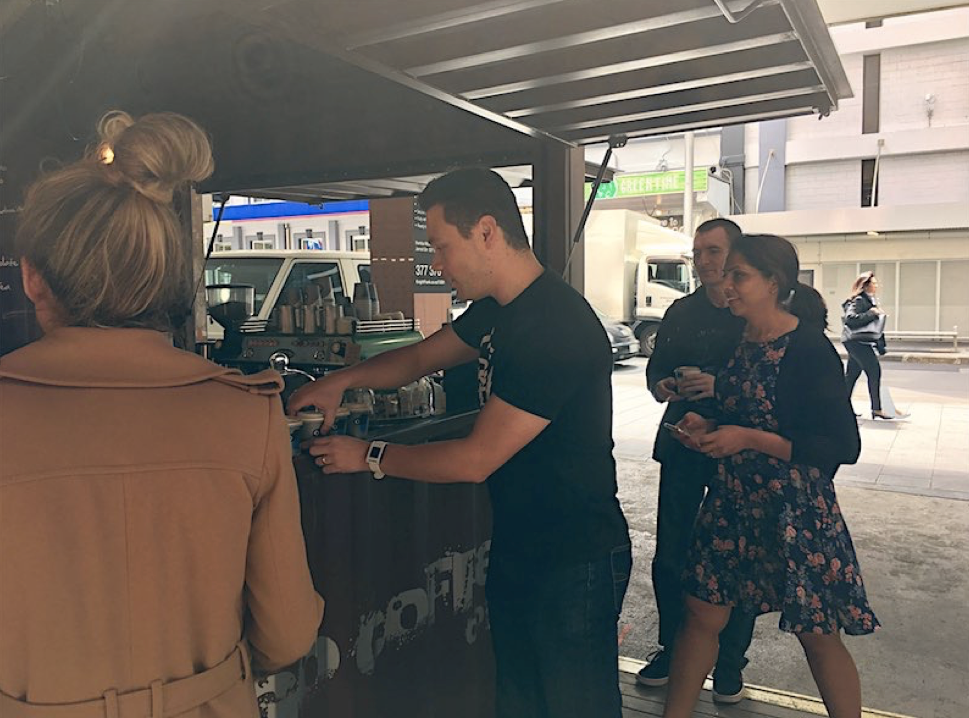
Cafe #1: Cargo Coffee is a small size cafe in Auckland CBD that mainly focuses on coffee takeaway.
Cafe #2: Queenies is a small-medium size cafe in Freemans Bay. Cabinet food / Kitchen / Indoor and outdoor seating.
Cargo cafe, located conveniently only few months from our office.
Step 4
Prior to the testing session, a tablet with the coffee queue app (bubble.is) was setup at the cafe counter to track the orders that are coming through. Push Notification done using Push Bullet & Zapier.
Tablet app for the cafe kiosk, displaying orders as they come in.
11. What did we learn from user testing?
Order database from the two cafes.
Sample Feedback from Cafe 1
Once a coffee is made they look around the space to see if they see
anyone waiting and call out the name.
If no one is waiting, Barista writes the name of the order on the rim of the coffee cup and place it on the edge of the bench.
The “accept” button was a bit too small, must be easier to accept
Need to dismiss completed orders in order to focus only on new orders.
Text for extra instructions was too small, Milk and Size should be consistent options, need to be readable when glanced.
Sample Feedback from Cafe 2
Initially, drinks were made with no names and no indication of customisations (sugar, no sugar…), thus confusion
Afterwards, barista got used to calling names for orders
Most people arrived right time for pickup
Completed coffees that are not picked up yet are placed on top of the coffee machine to stay warm.
Physical customers prioritised over tablet
After shifting the tablet to an optimal position, and orders were getting accepted quicker.
13. Retrospective
Obstacles
The four weeks timeframe has been quite a constraint, considering we had to run two channels of testing, while iterating on the designs.
Limited opportunity to conduct research & testing.
A lot of stakeholders to manage, thus have to facilitate discussions and justify each of the steps we take to them.
Had pressure from wider team to narrow down on a design, in order to provide estimates
What would I have done differently
Streamline how we conducted real-world testing and just test more cafes, as with each time improving the process.
Explore other channels to display orders. Try using BYOD (Bring your own device), or even text messaging.
Work more onsite at the client office to bridge that communication gap.
Would have like to do market validation and feasibility scenario testing on the consumer side (coffee drinkers), eg: deploy marketing material and scope out market response to the idea, pricing & concept.
What’s next?
The client presents the workshop findings and proposal to their executive level team in order to get fund for the next project phase.